Scott McCloud’s Theory of Artists

6 04 2009

Scott McCloud, the famous comics theorists, arranges artists into one of four categories in Making Comics, depending on their means and aims. Why four categories? Because two leads to polemics and more than four is just complicated (Carl Jung also thought so).

  1. The Classicist: craftsmanship, excellence, mastery. Walt Disney, Leo Tolstoy, Shigeru Miyamoto.
  2. The Animist: characters, story, effective storytelling. Jack Kirby, Ivan Turgenev, Naruto pre-time skip. Scott Pilgrim. Loony Tunes. Shadow puppetry.
  3. The Formalist: examining the boundaries of a given art-form and stretching them. avant-garde comics writers, Dostoevsky’s Notes from Underground.
  4. The Iconoclast: honesty, authenticity, humanness– showing the full truth, no matter how ugly it may be. R. Crumb, Dan Clowes.

Each of the four types has a particular kind of “beef” with the other three:

  1. The classicist accuses the animist of simplicity, the formalist of meaninglessness, the iconoclast of ugliness.
  2. The animist accuses the classicist of overwrought craftsmanship, the formalist of obtuseness, the iconoclast of pretentiousness.
  3. The formalist accuses the classicist of being reactionary, the animist of being trivial, the iconoclast of navel-gazing.
  4. The iconoclast accuses the classicist of soullessness, the animist of dullness and the formalist of meaningless abstraction.

It’s an interesting schema, one that feels complete. What are the forms of art that you find compelling and where would they fit? Hayao Miyazaki:1 & 4? Haruki Murakami: 2 & 4?


Dream #1: Pomegranate-colored Ocean

16 02 2009
Dream of a Pomegranate-colored Sea

Dream of a Pomegranate-colored Sea

I’m at the beach walking with two friends I know from real life, one male and one female. We got here walking through the suburbs, talking the whole time. The sunlight is fading, it looks red, lighting up the red ocean and the beach in a dramatic way. There are bits of cloud floating right on the surface of the water, they rise when the water rises, falls when it falls. I see some people in the distance surfing on surfboards that light up with blue LEDs.

We go to a darker area of the beach and I think to myself, “This is a dream.” I feel anxious, now that I’m lucid, and my companions start to develop a fearful aspect. I grab my female friend and hold her close to me, even though her face has started to transform and warp. The world begins to fade to white, as I lose my hold on the dream… I try to project empathy onto my friend; even though I’m afraid of what she may become, I try to remind myself that she’s part of my imagination, part of me. I art thou, and thou art I, I say. She’s starting to become a robot, then a vaguely Bruce Lee-ish figure. I don’t see what her final transformation is, because the dream ends.

Ever since I read Stephen LaBerge’s Exploring the World of Lucid Dreaming, I’ve been keeping a running journal of my dreams. It’s definitely a fascinating process, I’m not sure I can recommend it whole-heartedly to everyone, since it is a somewhat time-consuming process, and most dreams are not actually very interesting. In my experience, it’s only been a handful that really have the power to shock and awe.

One surprising side-effect is that writing down my dreams first thing when I wake up in the morning has a beneficial result on creative writing… It’s easier to imagine completely new scenes, “OK, I’m supposed to write from the perspective of a four-year old girl? Well, that’s not as weird as last night, when I dreamed that I was an octopus.

The slightest distraction as you’re waking up usually means that you’re not able to remember your dreams, even if you just woke up a couple seconds ago, so it’s a useful exercise in developing concentration and memory. In this way, I find it useful to think of new creative writing endeavors as projects of active remembering and not of creation from nothing. I’ve got everything I need somewhere in my head, I just have to uncover it.


Sam Sparro’s “Black and Gold”

11 02 2009

I’ve just recently started listening to Sam Sparro’s song, “Black and Gold” after I heard it at a party and I kind of regret that I’m always a year behind on pop music nowadays. Word on the street is that the rest of his music is pretty lame, but “Black and Gold” is an absolute beast. It’s the sort of song I can’t stop listening to, because everything else on my iTunes just sounds awful in comparison.

The song is brooding and metaphysical, kind of like the vampire to TV on the Radio’s werewolf. Sparro’s cabaret-style hamminess is just the cherry on top of the sonics: dance club pistons; lots of New Wave synth washes; echoes of Pink Floyd. It’s somewhere in between Stevie Wonder and New Order, pretty much uncharted territory since Prince. It’s also, well… kinda gay, for lack of a better word, but not in a Beyonce kinda way (although I’m cool with that too). What makes the song so moving is its lack of campiness by comparison. I’m also thinking Pet Shop Boys, David Lynch.

Sparro is gay and Christian, the latter adding to the depth of the lyrics (he’s also Australian).

If the fish swam out of the ocean, and grew legs and they started walking…

If vision is the only validation, then most of my life isn’t real…

These lyrics are references to the whole Creationism mess in the States, but Sparro unexpectedly decries any worldview which is solely positivist or materialist. Science is all well and good, he’s saying, but we’ve lost sight of spirit, of meaning.

If you’re not really here, then I don’t want to be either, I want to be next to you…

This lyric conflates erotic desire and spiritual longing. It’s a courageous and truthful move, one that I thought would’ve caught a lot more flak (maybe we’ve all moved on since “Like A Prayer.”) It’s this mix of dance club sensuousness and fervent idealism that’s the perfect soundtrack to my job hunt in troubled times…

Fanny Pak dancing to Black & Gold:


Brillante Mendoza’s Serbis and Filipino Narratology

9 02 2009

There’s a new arthouse movie called Serbis by Filipino director Brillante Mendoza that’s opening pretty soon… It’s one of those movies that received a polarizing reaction from audiences at Cannes, who either praised it or walked out of the theater. People have been comparing it to Tsai Ming Liang’s work (it’s about a working-class family that runs a porno theater). An article I read about it said that Mendoza wanted the street scenes to have uncomfortably loud sound engineering because ‘that’s what Third World countries really sound like.’

What got my wheels spinning was reading some of the comments on this review of the movie from the NYTimes, especially about the less crowd-pleasing aspects of the movie, how it tries to incite discomfort in the viewer, how it refuses to cut out sordid details or provide a happy ending.

… The Philippines hardly gets any respite from all sorts of exploitation – and that includes this sordid enterprise from French financiers and the supposedly well-meaning director Brillante Mendoza. That’s the sad history of my country and we are still waiting for the day when all these shameless carpetbagging for recognition from foreigners and the marketplace ends and Filipinos themselves will have the courage to portray their country in a more decent and balanced way.

… The Philippines has a morally-ambiguous President, with Catholic bishops imposing their morality like Spanish friars, and yet the Philippines is among the most corrupt governments, and societies, in Asia, how inept Christianity is. One has to delude onself continuously to persist in this hypocrisy. There is no salvation, just hard-nosed reality viewed with clear eyes.

Serbis is yet another turgid exercise in Third World misery. It was produced by a Frenchman and made obstensibly to titillate the foreign market. The movie hardly made waves in the Philippines. Westerners like to lap up movies like Serbis.

I don’t have any answers here, only questions. Is Serbis another instance, like Slumdog Millionaire, of “poverty porn”? Or is it less disingenuous, more pure because it doesn’t try to pull any punches?

Lastly, the most fascinating question: is it true about us Filipinos that we prefer happy endings, sometimes beyond all reason? It calls to mind the amazing documentary Imelda, which features extensive interviews with the former dictator’s wife thirty years after the People Power ouster.

The sway that narrative holds over the Filipino psyche is undeniable when one looks at our history. A thoroughly corrupt dictator and his delusional wife (precursor to the excesses of Sex and the City?); the passions of the Seventies under martial law, when thousands marched (nonviolently!) to eject them from Malacanang Palace; the dismay we felt when we realized that this did not necessarily spell “freedom”… The diminishing hope that each new president will somehow set things right; the state of semi-exile my parents went through (albeit a white-collar one, and voluntarily); karaoke songs sung by OFWs, longing and nostalgia. Food riots, charter change… After all, we elected Erap long after Reagan put movie star presidents out of style. Who wouldn’t want a happy ending somewhere, after all that? *long sigh.*


Shigenori Soejima & Kazuma Kaneko: Character Design and Religious Imagination in Video Games

2 02 2009

In a bookstore near St. Mark’s Place in NYC I discovered the Pictoplasma book, a hardback compilation of the best in character design, taken from street art, Nintendo games, comic books and commercial graphics. After years in middle school idly doodling Yoshi and Kirby in the margins of school notes, this felt like a long overdue vindication of the work of talented cartoonists, character designers and iconographers who’d captivated mine and other kids’ imaginations.

In Japan, cute mascotry sells everything from insurance to suppositories (I made that up). The television station NHK is famous for a rotating slew of mascots, including the infamous Domo-Kun. Commercial art seems to be the sole provenance of the well designed character these days, but the best designers have always had a deeper aspect to their work: the power to condense many complex, sometimes unrelated concepts into a single image and enhance viewers’ abilities of empathy (a la comics theorist Scott McCloud‘s theory of iconography). Today I’ll take some examples from the works of Shigenori Soejima and Kazuma Kaneko, both of whom design characters for Atlus Inc.‘s flagship series of RPG titles, and show how they remake mythological material in a form which can best be described as visual storytelling.

The PS2 video game Persona 3 draws on a rich background of sources, the foremost being Carl Jung’s more mystical works involving alchemy/individuation and the Rider-Waite Tarot deck. The series is one of my favorites (profile post forthcoming) because of its coupling of social sim gameplay with pure dungeon-crawling. As a schoolboy, you make friends in the daytime, at nighttime, the strength of your friendships helps you stop encroaching shadows from overrunning a vast collective unconsciousness. The epic feel coupled with the mundane is a bit like Harry Potter, the video game, and is a fitting tribute to Jung’s vision. The high point of Shigenori Soejima’s design are the Personas, the archetypal “other selves” of the game’s main characters. Shown below is the main character and his persona, Orpheus:

Main Character & Orpheus

Persona 3: Main Character & Orpheus

The red scarf that Orpheus wears is a reference to his disembowelment and beheading in the underworld. The school uniform seems to be a visual rhyme of the Victorian era of Jung & Freud, the protagonist looks kinda like Lil’ Nietzsche or Kierkegaard. The digital font and the robotic aspect of Orpheus finally are a mark of P3’s other main worldview: futurism. The slick surfaces of the game underscore the timelessness of the narrative which is drawn from the hero’s journey.

persona48325

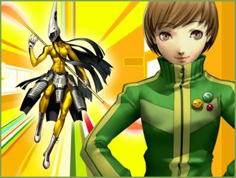
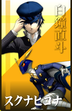
The direct sequel, Persona 4, also designed by Soejima, has a retro, ’70’s ethos of bright colors (one of the main characters summons a persona that dons Bruce Lee’s iconic Game of Death outfit). In this game, the collective unconscious is accessed through the television, which is a neat excuse for Soejima to throw in visual checks of Japanese television shows in his character designs from old myths: check out Konohana Sakuya via Power Rangers and Issun Boshi Sukuna Hikona, after sentai shows like Ultraman. Kuma is at once the most compelling character, and also seems to be a meta-commentary on cast-aside mascots. An oddly naive stuffed bear that the main characters encounter in their first foray into the TV world, Kuma’s design is taken straight from live action kids’ shows of adults in fuzzy suits. His insides are hollow, however, and his digs decidedly dystopian, which adds a creepy veneer to the Disneyesque. Cuteness coupled with the menace of the unconscious world is a memorable pairing, a critical dig at capitalism’s appropriation of human emotions and desires through the figure of the mascot. “Sanitization” is the word that many use in discussions of Western modernity’s worst aspects; the main significance of this word is the artificial division of the innocent, appealing aspects of life from the meanness, the guts of it.

Kuma and Kintoki-douji

Kuma and Kintoki-douji

Murakami's Mushroom Cloud

Murakami's Mushroom Cloud

Ainu Flag

Ainu Flag

Kuma summons the persona Kintouki-doji (the adult version of Kintaro, that cute kid who frolics with woodland creatures). This monster could be the fodder for many hundreds of Asian Studies papers about postwar boom & anxiety, because in its cute little paws it wields a GIANT FREAKING MONSTER ATOMIC BOMB. The dominant visual theme of Persona 4 seems to be cuteness coupled with threat, alienation and dis-ease. As if to emphasize this, the dust clouds that signal enemy deaths are cribbed from globally renowned artist, Takashi Murakami (he of the Louis Vuitton bag). Later, Kuma evolves into Kamui, the name (like Kami) referring to the many spirits of Ainu mythology. The transformation makes sense, given Kuma’s outsider origins, and the design’s ethnic sources may or may not be considered nationalist– the specifics are the material of another discussion.

Vayu from Digital Devil Saga

Vayu from Digital Devil Saga

The slightly raised leg of the Vedic god Vayu, a playable character from Digital Devil Saga, references yogic poses and the stances of traditional Hindu iconography. The devils of the game’s title are the villains AND the heroes in this game, their world is the ambiguous one common to animism and some Eastern religions: one populated by all-too-human spirits that are either apt to help or harm, often at the same time. Eschewing traditional images of devilry like ram’s horns and forked tails, Kaneko manages to efficiently convey a sense of numinosity (religious fear and also awe) first of all with the closed crocodile mouth positioned unexpectedly at the top of the head (a devourer), coupled with the saintly, ragged robes of a monk. The black and white bands around the legs remind me of checkered Balinese spirit cloths, a visual marker for ghosts and the afterlife. The character attacks with a knife held between its toes (shit is so cash), a graceful killer reminiscent of Shiva, badass slayer AND dancer. It’s an unsettling depiction of divinity, the stony face with indentations vaguely humanish yet completely impartial, a force of nature. It reflects the designers’ vision of a world where the forces of creation and destruction are inseparable, death only a step away.

narasimha1a

In a post-Mickey world, the creatures of our design seem to increasingly lack the power to shock or excite. We’d do well to remember, as Jared Diamond exposes in Guns, Germs & Steel, that the technologies of our mind (writing), are no less singular, breathtaking leaps of genius than other landmark technological breakthroughs (fire, the wheel). A while ago, I read a passage in an archaeological article (can’t seem to find it), in which an anthropologist examines a Mesopotamian artifact, a figurine of a man with a lion’s head. Before, most art was simply figurative, she says, drawing upon natural forms. The figure marks a sophisticated advance in how humans conceptualize their relationship to nature: a technology, if you will, unprecedented in the period before the object’s creation.


Performing Butch & Femme on ABDC Season 3

30 01 2009

Humanities heads who ever wrote a 10-pg. essay citing Judith Butler can tell you when it comes to Performance-with-a-capital-P, conventional wisdom about gender does not survive the translation from society to stage completely unscathed. Rather television and popular media are places where myths are constructed from the ground up, moment to moment. Particularly transgressive performances have the potential to flip the script, ushering in momentous change in consciousness.

Those who followed Season 2 of America’s Best Dance Crew were witness to a sometimes enraging often engrossing spectacle, a metadrama in which the fortunes of the crews were deeply entwined with forces of butchness/femmeness, queerness, imperialism and American regionalism. We saw Filipinos… lots of Filipinos. We saw Super Cr3w take the title (the better to sell sneakers). We saw grown men cry like babies  (Supreme Soul, Boogie Bots, basically every crew that was all dudes). Lastly, we saw an underdog crew of fiercely gay boys take it nearly to the top and then get plain ROBBED.

Season 3’s analogue to Season 2’s Fanny Pak might be Beat Freaks, a crew of stone cold baggy pantsed B-Girls. Compared to the all-female crews of S1 and S2, this is a breath of fresh air. “Can it be?” we ask ourselves. “A crew made up of all grown women who are not in miniskirts and constantly shake-shaking the buns?” The awesomeness of it all planted the question in many minds, mine included: ABDC’s first ostensibly all-lesbian crew? Does it matter? They’re so cool!

That’s why it was such a bummer watching the reveal on BF’s Britney Spears challenge for the week: “Womanizer.” With a smile on the judges’ faces and the extra admonition: “You’ve shown us the tough. Now show us the sexy.” Read: “You are threatening us with your dyky ways. Put some lipstick on.” What did I expect though? In Viacom’s world, not everything under the sun is permitted.

It was an interesting episode tonight, the other highlight being Quest (worst haircuts ever) getting unexpectedly into character with “Toxic.” Despite being on MTV, at its high points ABDC has a weirdly innovative feel to it: a kind of laboratory where male and female bodies try different personae on for size and yield the sometimes savory, sometimes unappetizing results up for judgment. The “Butch & Femme” of this title’s post comes from an entry on Kate Borstein’s blog concerning WALL*E where she asks the question, “When I first saw the film, I saw a boy robot and girl robot… How and why did most of us jump to that conclusion?”

ABDC is the rare opportunity to see the all the workings of the machine up close, the gears ticking away. Myths are made, judgments are pronounced in the name of aesthetics. Mightn’t Fanny Pak’s dismissal last fall be interpreted as punishment?

PS. My other favorite this season: Ringmasters. Truly some avant-garde shit right there.
PPS. Beat Freaks still ripped it.